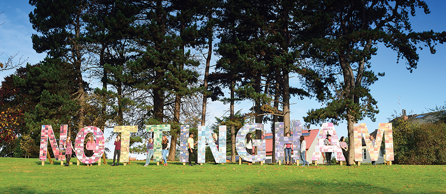
Our brand identity has evolved
May 25th, 2023
The university has been developing the visual identity of our brand to support accessibility and strengthen our connections to Nottingham.
Key updates include:
- Retiring our five core blues and introducing one new primary blue – Nottingham Blue
- Introducing a new secondary colour and a simpler neutral palette to support accessible design
- Adjusting the logo placement
- Removing the gradient (now only exists in the print version of our logo)
- Consolidating our logos and fonts
- Refreshed and updated guidance on how to:
- Create bespoke illustrations
- Use the square device creatively
- Select photography and video to represent the university’s values and personality, including using creative compositions, natural unposed shots, focusing on our places and spaces and seeding our colour palette
Our internal branded templates have also been updated to reflect these changes, including a newly designed university PowerPoint template.
Tags: brand, branded templates, identity, Visual identity
Comments are closed.
Other

Need news? See you on SharePoint
After 14 years of service, Campus News is being retired as the university’s staff news platform. […]

Roads and car parks closed for refurbishing work
As part of ongoing road improvements at the university, works will be taking place to resurface […]

